When prospects first visit your website, they’re mostly just scouting for potential red flags – and bad website design is one of the first giveaways that they’re better off taking their business elsewhere.
The good news is that creating a flawless website isn’t hard in 2021. You just have to be cognizant of a few basic design mistakes and you’ll be converting visitors in no time.
Let’s explore some of the key web design mistakes that you absolutely must avoid in 2021.
Tone it Down with the Design
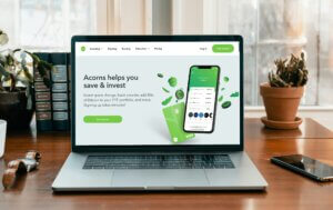
Minimalism has become the architectural style of choice for interior designers due to its functionality and simplicity. This trend has caught on in web development too. People generally don’t like seeing busy artwork and overwhelming decor. What they want, instead, is something simpler that gets the job done. You can still create daring and dramatic artwork on your website, but you should tone it down with the clutter.
Instead, use linear shapes, luscious colors, and, if possible, bespoke artwork to offer a unique user experience.
Auto-playing Videos
No one likes to be force-fed content and tolerance for this kind of practice is wearing out. Most news websites like CNBC and BBC almost get away with it because… well… they’re news websites and will always stay in demand. But for niche websites and businesses offering services and products, you don’t need to auto-play videos.
If you have to use video, keep it paused and let the user know they can play it if they want. If you must play video, then mute it first with the option to unmute. Additionally, do some A/B testing to compare your landing page with auto-video and a page without one. You’ll notice that the auto-video might be tanking your lead generation efforts.
Not Having a Mobile-Friendly Website
With over 3 billion people now using a smartphone, there’s no reason why you shouldn’t invest in mobile-friendly themes. Moreover, mobile-first websites tend to rank better on both mobile and desktops. You can check if your website is mobile-friendly by simply loading it up on your phone. Or, you could use a range of free tools from Google and Bing to check for responsiveness.
If your website isn’t responsive, or if the UI looks broken on smartphones, then it’s time to go back to the drawing board.
Disruptive Pop-Ups
Most of us have encountered pop-ups that suddenly disrupt our overall experience. It can be distracting and annoying to nearly everyone. In general, if a user wants to download something or subscribe to your newsletter, they’ll do so without you having to ask them. What matters instead, is offering them a good user experience first, and then pop-ups second.
A good rule of thumb would be to wait until a user spends at least 5 to 10 minutes on your website (indicating interest) before prompting a pop-up.
In some cases, you might want to avoid pop-ups altogether because some users think of them as malware. We’re not advocating against pop-ups – there is a time and place for them. But you have to extensive user testing to see if it will work for you.
Well, that about covers it for now. Happy web designing and here’s to a new year.